
 It's no secret that I am a walloping great fan of Jon Davis-Hunt's work and the amazing thing is, he just seems to get better and better! The Eagle-Award best cover finalist (and, at time of writing, hopefully winner!) has turned out another amazing cover after taking over Warren Pleece's art duties on Alec Worley's fantastic Dandrige strip.
As usual, Jon has sent a brilliant step by step breakdown of each stage of the creative process as well as some superb commentary. A top guy! So, over to Jon:
"I usually send Tharg three or four sketches initially for a cover, but in this case, I had a pretty clear idea in my head what I thought the cover should look like. So, I sent Tharg this sketch with an short accompanying email, just explaining the final look for the cover. While I'd been doing the initial research for the Dandridge series, I'd found a load of Vaudeville Edwardian style posters online, so wanted to capture some of that feel in this cover. At this point, I still hadn't finally decided on the details of the ghosts armour, so in this sketch, he has solid steel gauntlets. He also has a visor as I wasn't 100% sure how it was going to look yet."

Man, I love this next image. Jon says "For this cover I inked Dandridge in full first. The original idea for this was that I was contemplating have the ghost armour slightly transparent, so I intended on effectively inking the ghost in on a separate layer in photoshop and then taking the opacity down later. However, shortly after I finished inking Dandridge, I decided against that, as I wanted instead, to make the armour look really heavy and reflective and as the background was going to have a delicate and intricate Edwardian design, I thought this might clash if the inking on the Ghost let the background show through."
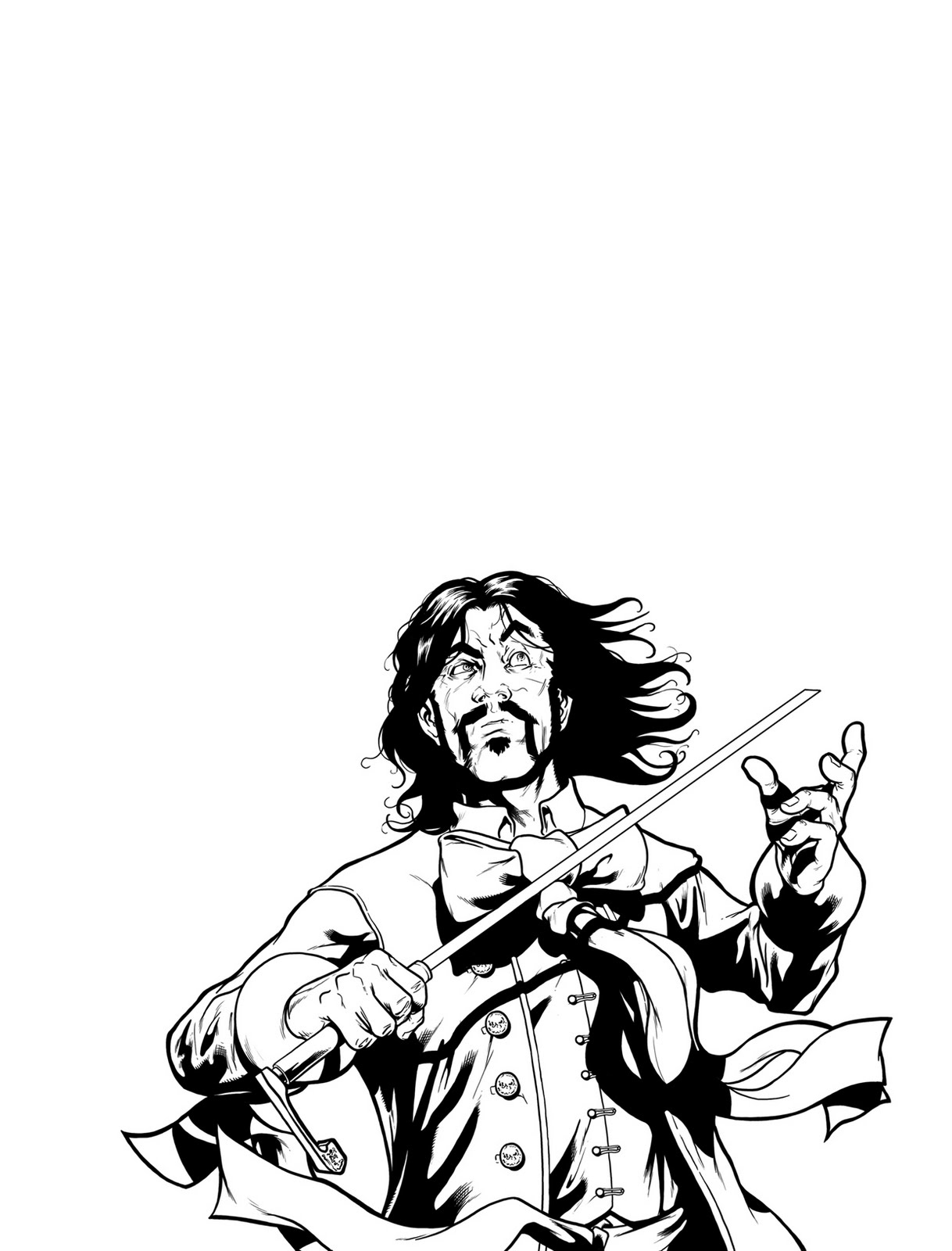
"So I went straight on and inked in the ghost. It was at this point I decided to give the Ghost's gauntlets the segmented metal look - mainly because I always loved this effect when Marc Silvestri used to ink Colossus back in the Xmen in the early 90's."

With the inks in place, it's time for some of Jon's exquisite colouring; "I then flat coloured the image, using the colour swatches I had already built up from doing the series."


Jon adds the background detail - "I then added in the background, which I just kind of made up on the spot, based on a whole host of Edwardian posters and playing cards..." Bloody show off!

And finally, some of the old JDH magic, "The final stage was to add in the shine and glow effects for the ghost and armour and also Dandridge's blade. I then added several washes to the overall image, to pull the colours together and to slightly age the image, which I then enhanced by adding in several textures, from scanned in pieces of paper and from sources I found on the web of interesting textures. Again, I wanted to really give the poster a worn, aged, Vaudeville quality."
 On a final note, Jon says "I thought I had been quite clever doing a historically themed image, but then literally, the day after I finished the cover and sent it in, I saw Henry Flint's awesome Shakara cover, which also used a distinct time period for inspiration. Damn. : ) " Modest as ever, I think this cover even gives Henry a run for his money!
Jon's artwork on this strip has been amazing, below is an actual page from the story...
 So, let's call time on another absolutely stunning cover from Jon. I'd like to thank him for (yet again) taking the time to send the pics and the brilliant commentary. Please go and visit his site here and send him the gushing plaudits he deserves!


No comments:
Post a Comment