Tuesday 24 December 2013

Cliff Robinson and Dylan Teague - Christmas BOKs!


Ho ho holy Joe Christmas, that looks painful! The Mighty Cliff Robinson once again gives us, quite literally, a cracking cover. Cliff is an absolute powerhouse of ideas, always coming up with inspirational takes from Mega-City life, be it a snapshot of Dredd in action or tightly focusing on a piece of Justice Dept. equipment, Cliff always gives us something a little quirky or different.

The title of this piece is 'A Lasting Impression' which you can see was his suggested strap line for the image...


Oh that Dredd, what a nutter.

'The grumpy old Lawman brought down his big head'

However, Tharg had different ideas. Over to Cliff to elaborate - "So here is the Christmas cover and it's roughs. As you can see, it was not originally conceived as a festive cover. The 'Punk Santa' was Tharg's inspired idea!"

And what a cool idea it was! Here's Cliff's pencils with added festive Santa hat...

 The nutcracker - sweet!

With the image given the festive seal of approval, Cliff beautifully inks those glorious pencils. Please, as a Christmas treat, open the image below in a new window and spend a bit of time looking at it, I promise you won't be sorry.

Have you seen my Dredd impression?

Once again, Dylan Teague had the unenviable task of doing justice to those fantastic inks and as usual didn't disappoint. He's done a horribly gory job!

Have a drool yule!

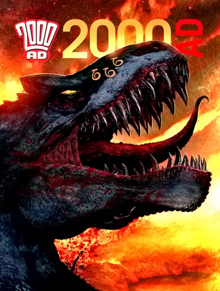
And here's how the final image looked in the shops - nice strap line by the design droids!


Festive thanks to Cliff and Dylan for sending the images, what a fine set of Droids working in perfect harmony. Perhaps Tharg should rivet them together droid centipede style!

A very, very Merry Christmas to everyone who reads this shambles of a blog and to all the amazing artists who contribute! I love you all inappropriately! 


Monday 9 December 2013

Henry Flint - Die Fleshy One!


Ooooh, Henry Flint isn't looking too well is he? Here's the final, Flesh-ripping standard prog cover of 2013 by the brilliant Henry Flint. Over to Henry to tell us more.

"In keeping with many self portraits in 2000ad over the years (artists using their own image for facial expressions mostly) thought I'd have a go. Tharg had the idea of doing a warning poster for the cover which hints back to old progs. Wanted the same feel as those 1970’s Rabies posters up around Customs & Excise houses. Living by the sea back then put a sinister edge to the sea side, ice-cream, buckets and spades and violent death."

Yep, got to agree with Henry there, as a kid growing up in the 70's, the three things that terrified me most were rabies, pneumonia and the Yorkshire Ripper - happy days!

Budgie smugglers are okay though. 

Get DOWN Shep... 

Below is Henry's rough for the gruesome cover...

 
Thrillpower overload?

And finally his concept art for the cover which is pretty damn close to the printed version...


 A 70's poster warning of the deadly disease, Blurb!

 "I’m aware the narrowness of the final artwork submitted needed Pye to work extra hard to make this work. He did a great job. The end result I hope is creepy and not just because it has my face on it!"

Sadly, those rollercoaster riding boy scouts with the strawberry milkshakes on Jim'll Fix It never learned their lesson...

Yeah, Pye-01 certainly earned his oil rations that week, doing a top job of putting the elements together. Here's how it looks stuck to the wall at your local Customs and Excise house!
 
Henry Flint was seriously miscast as Carrie in the remake.
 
 Great big walloping thank you's to Henry, what a marvellous fella and a cracking cover. Be sure to check out his marvellous blog here: http://henryflint.wordpress.com/


Tuesday 3 December 2013

Mark Harrison - Pain in the Gas.


Mark Harrison treats us to one of the most sinister 2000AD covers of the year as the forces of Earth attack The Enemy planet!

"Tharg wanted the Earth ships converging on the Enemy gas planet so I did this mock up:"

Death Planet?

"I used existing artwork and just made up a formation, a pentangle of ships heading towards a  demonic planet. I originally conceived of the Enemy as a combination of virus and gas giant weather storm like the eye of Jupiter.  A "Supercell" (is that a pun?)"


Mark gives us a virus, thanks 'mate.'

"Constantly boiling and churning, shooting off bits of itself, although on this scale it was more like solar flares taking hours to leave the surface where lightning storms raged in the glowing heart of the dark gaseous maelstrom."

"I wanted it to look like a violent and foreboding place and it was tricky to get the right sense of glow and darkness.  Worried it would print too dark as a cover I erred on the side of caution here and made it brighter that I would have liked."


The contents of my arse after fizzy pop and beans

"But I was right to do so as it printed up pretty much as I wanted/expected with just a loss of range value in the shadows which is typical. I actually lighten the blacks just a tad, but darken towards the corners so the black borders of the strip should be the darkest part of the page."

"There should have been a ring of ships, like Saturn's rings around the planet and I did plan for them but it looked messy and bitty so I dropped them for a "clearer," simpler image of Enemy and ships."

"People may site a recent Dr who episode as inspiration for the skull face in the cloud/planet skull thing. It did consider it briefly, but I was going back further to Luc Besson's The 5th Element for my inspiration and "Mr Shadow" and the V'ger Cloud in Star Trek: The Motion Picture."

"Makes a connection with the reader, puts a  face to the enemy,  literally!"

And here's the final cover in all its' spooky glory!


Here's how the prog looked on your newsagent's shel... hey wait a minute, below is Mark's suggestion for the cover followed by PYE-01's official  version...

Spot the difference!

So a big tha- oh, not one to skimp on detail, Mark sent even more goodies from the strip!

"A sheet of spaceships used in the strip. Originally I was going to have the ships appear and move as vertical spires, like churches drifting  through space (more like tall ships). It would have been more original  but  it looked a bit directionless so that idea only made it into display screen graphics."


Mightily impressive spaceships

Ships ahoy!

"The original enemy concept that was used in the strip. This has more of a solar flare feel about it, bursting and turning itself inside out. I experimented with different coloured internal gases, having a red gas on the inside , but that made the skull face look like a clown!"

"I did save the idea for the strip though when the Earth Ships head in to the enemy, the outer skin of green gases pulling apart to reveal a red interior."

A bad case of PInkeye

"My toy child's skull which was originally day-glo colours bought form me by my dad from Ripley's "Believe-it-or-Not" on the Blackpool pleasure beach."

"Kids used to have great stuff like that back then; gruesome attractions like Ripley's "Believe-it-or-Not"  selling gore and freak show oddities and horror tales to impressionable minds amid the Dr Who and Gerry Anderson Space City Exhibitions of the 1970's that were on the seafront."

A guest appearance from Zombo

"I created a sheet of oil rigs and  ocean liners photographed  at night so only their lights were showing and made up mirrored images of them that I could use to drop on space ship silhouettes to give the impression of lighting."

Some of Mark's cast collection of 'Oil Rig at Night' photos.
"The Earth Station symbol I came up with to suggest the human forces  was a deliberate nod to the Terminator's symbol in Nemesis the Warlock."

"So glad I don't have to paste, resize and distort that for every other panel! I'm taking it easier for the next strip!"


HUUUUUGE thanks to Mark for sending the bits and bobs for this weeks' cover and more, brilliant stuff as ever!

Monday 25 November 2013

INJ Culbard - Points of View.


Here's another dazzling cover by the inimmitable Ian Culbard. It's a tense scene Brass Sun which highlights the fantastic creativity on show in the series. I'm loving the perspective thing Ian's go going on, I'm a sucker for themed covers! Over to Ian to tell us more...

"The initial brief was simply a picture of the Red Wench for the cover. So I produced a couple of shots of it. One as it rises up out of the clouds..."  

Initial art for Dolly Parton's abandoned Prog Rock concept album

"And the other as it's flying towards us..."

Twin engines of destruction

"However, Tharg also wanted to feature the characters and once again, other than almost replicating a panel from the strip itself or doing something that felt like a panel from the comic. I decided to repeat the POV formula of the previous cover where we saw things from Ramkin's POV only this time we'd see it from Sept's POV.

"I spy with my little eye, something beginning with z..." Worst game of I spy ever.

"Could this become a theme for Brass Sun covers? I don't know. Never say never!

I for one hope so, I adored Clint Langley's ABC Warriors series of covers and Simon Davis' Ampney series' have been brilliant. Go for it Mr Culbard, POV's all the way!


Ah yes, a big fireball next to highly flammable balloons! What could possibly go wrong?

Here's Ian's previous cover for those with thrill-addled memories...

It was a one eyed, no horned, scything, purple people beater!

And here's how the design team put it together, splendid!

Put your hands in the ay-er, and wave 'em like you just don't cay-er!

Twin Zeppelin sized thanks to Ian for sending the images for this visual treat! Check out his blog here!

Sunday 10 November 2013

Clint Langley - Dinosty!


Big head? Check! Buckets of gore? Check! Scary dinosaur? Check! It must be Gorehead then!

Clint Langley goes back to his Dinosty roots to bring us this fearsome, blood drenched Flesh cover. Older readers will remember Dinosty, a biting satire which not-so-subtly depicted a royal family as a bunch of out of touch dinosaurs and gave Clint his break in 2000AD.    

Harrysaur?

Among the images Clint kindly sent for the cover, was this stunner... 

Hot saurs.

He said "I've sent a work in progress that was dropped as it was too similar to Paul Marshall's cover of Prog 1784." Such a shame as it's a fantastic piece of work. Below is a reminder of Paul's red hot cover.

Oooooh, this Rex is on fire!

With a change of direction needed, Clint produced these terrifying inks...


Do-ya-inky-saurus?

And here's the fully rendered version that made the cover...

"I said HELLO!" 

But wait, Clint also sent this version! He said "I've included an updated version I did but unfortunately too late to make the printing." Man, it sounds like this cover was plagued with bad luck but thankfully it still turned out to be amazing!

You've got red on you.

Below is the cover as it will appear in your local thrill merchant, I'm sure there'll be some juves desperate to get their hands on that!

Gore blimey!

Satanus-sized thanks to Clint for sending the images for this cursed cover! It seems Clint's misfortune has been to our benefit as we've been absolutely spoilt for rampaging dinosaur images this week! 

Thursday 7 November 2013

Karl Richardson - Let us Prey.


It's behiiiiiind you! So how's this for a brilliant cover from Karl Richardson? I love it! Certainly a contender for cover of the year (coming soon folks1) for me! The cover features the terrifying Scrall from the excellent Dredd tale Prey. Below we see Karl's first idea for the cover - Dredd refected in the eyes of the beast... 

I spy with my little eye... 

Next the chosen idea...

The scrall loved it's Dredd string puppet.

And here's the finished image, just brilliant!

Dredd's new masseuse was a tad heavy handed... 

Finally, here's how the prog looks on the shelf, lovely and striking!

This weeks' cover by Skrall Richardson

Huge, huge thanks to Karl for sending the images, they're brilliant, as is his work on the strip!

Monday 4 November 2013

Mo Ali - Rogue Trooper


Congratulations to 2000AD Messageboarder Mo Ali who won September's art competition with the striking Rogue Trooper image above! The theme of the compo was Gerry Finley-Day, with several Rogue, Fiends, VC and Ant inspired entries! As ever, this blog features the creative talents of the winner so here is Mo to tell you more about the creation of his entry:  

"Rogue Trooper is a visually striking character, and of Gerry Finley-Day's work it is one of my favourites."

"So then, there's many different ways I approach doing any piece of artwork, usually more planning and prep time is involved in terms of conceptualising the idea, but with this I found out about the art competition a little close to the deadline, so I fell back on some tricks and techniques I've learnt over the years, using image referencing and photo-manipulation, along with traditional illustration."

"The initial reference I used for my base idea was this computer game version of the character:"

"Stak!"

"I took the character's general posture from this - though having to adapt it so it looked more dynamic and real-world, as well as using bits in the final piece."

"From here on out it was a case of finding the right sort of pieces (a nose here, a leg there...) from various photographic images I sourced, until I was happy with the Frankenstein's Monster-like result. With this rough jigsaw assembled I then began the process of mixing and merging - adding shadow and texture and 'filling in the gaps' essentially, illustrating over the seams until the composition looked cohesive and whole."

"Once happy I then added billowing smoke in the background for a visual point of reference (otherwise Rogue would just be standing in black emptiness) as well as highlights and lighting - from this stage on I tend to experiment and let a sort of instinct take over, adding colours, light and filters or taking away and reducing the piece, refining the art until there's a certain atmosphere and mood to everything. "

"The rain and lens-flare effects were the last bits to be overlayed, and were a nice accident as I hadn't thought about adding these when I began - an example of why experimenting can be a good thing."

"My intent was that the final artwork looked 'hyper-real', a part-filmic and part-comicbook cover."

"I hope Rogue Trooper fans like it."

We sure do Mo! Thanks for the insight fella and congratulations! Be sure to enter this months' art comp here, this month the theme is 'Spin Offs' and will be judge by the one and only Brian Bolland!