Thursday, 8 November 2012

Comic Archive - One Eyed Jack and the Death of Valiant!


This weekend sees the release of an excellent magazine featuring a host of articles and interviews with 2000AD legends such as John Wagner, Kev O'Neill and John Cooper. 'Comic Archive - One Eyed Jack and the Death of Valiant' is published by Hibernia Comics, who've given us wonderful reprints of classics The Thirteenth Floor and Doomlord.

 "But this building ain't got a thirteenth floor!"

It's a fascinating read, with articles on Wagner's ruthless cop One Eyed Jack (who laid the foundations of Dredd,) the final year of Valiant, the role of an Art Assistant (with some gorgeous images of classic 2000AD logos) as well as revealing interviews with John Cooper and John Wagner.

The fantastic article above discusses the role of the art editor and even includes an interview with Kevin O'Neill!

The meaty articles are complimented by dozens of classic images from the comic, including work from idols such as Ian Gibson, Carlos Ezquerra, Joe Colquhoun and Frank Bellamy. The art has been lovingly cleaned up the books' designer, Richard Pearce.  

The magazine is bursting with lovingly restored pages...

Over to Richard to tell us about his cover design "I'd previously designed the cover for Hibernia's reprint of the classic "Scream" series, "The Thirteenth Floor". Partly through necessity - there was very little, if any, suitable colour art to use - and partly through design, I ended up with a very clean black & white design that (hopefully!) was strong and bold, without being too plain."

"When David contacted me about producing the cover for his new project, he was keen to stick with something similar but he had a very specific idea of what he wanted the cover elements to be. He was keen to use the "One-Eyed Jack" and "Valiant" logos in the title of the book, and he had a particular image of Jack in mind that was to be accompanied by a snippet of text."

"My first draft of the cover was run off quickly the same night David sent me the scans he wanted to use for the cover. It was very rough, with no real clean-up on any of the logos or the pic of Jack, but it got things moving. At this stage, especially when someone has something fairly particular in mind, I find it best to fire a rough out so that there is something concrete to focus on. From here, we can start to eliminate anything that's entirely wrong, and I start to get a clearer idea of what the other person is looking for." 

Richard's rough and ready cover.

"In this case, David was not keen on the top bar, and he wanted the title to run "stacked" above the picture of Jack with the quote to follow beneath. He also wondered about replacing the "Death" in the title with the logo from the Valiant strip, "Death Wish", but I felt it would be a step too far, and would leave the title and cover feeling more like a collection of clipped logos, rather than something a bit more cohesive."

"With David's notes in mind I went back and started to modify that first rough. Partway through this process, it struck me that the typeface David had asked for the quote to be set in looked as though it might belong on a telegram, or an old police typewriter. I had a look for reference images and worked up a "frame" for the image that would make the picture and text look as though they had been printed on a spool of paper then torn from the machine. I also decided that the picture of Jack would look better if we cropped it down to just his figure, with some panels from a full strip behind him for a bit of texture."

Ripped from the typewriter

"I sent the fresh draft off to David and while I was waiting for his response I started playing around with the file. A full colour cover was out of the question, but I was worried that the stark black & white cover was going to be too plain. As an experiment, I took the Valiant scans David had sent to me and set them flowing diagonally across the front cover, dropping the whites back to a dark grey. It's an effect that's been used elsewhere that I quite like, and I thought it worked reasonably well here, so I sent off this alternate cover to David for his consideration."

Richard's unused idea

"This second go at the cover was in line with what he was looking for, and although he turned down the alternate cover I'd presented he was happy with the other draft. From there, it was a case of some final clean-up and sourcing a higher-resolution scan of Jack to replace the lo-res one I'd been using, then a couple of minor layout tweaks to finish the piece off, ready for print."


Thanks to Richard for those fantastic images and his fascinating insight. The magazine has now been sent to the printers and should be available very soon. Keep an eye on http://hiberniabook.blogspot.co.uk/ and the 2000AD message board to get your copy. It is essential reading for any 2000AD fan and I can't recommend it highly enough!

Sunday, 4 November 2012

Edmund Bagwell - Kleggsellent!

Klegg-High?

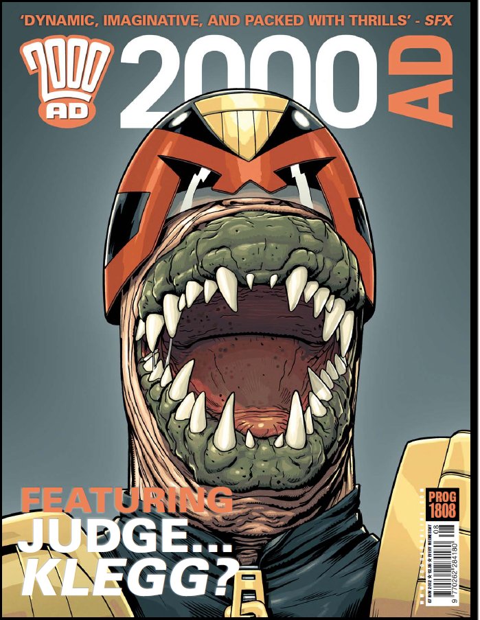
Good Grud, what's happening here then? The glorious Edmund Bagwell has produced this very disturbing cover of Judge erm... Klegg! I asked Edmund if he was around when the Kleggs made their first appearance in Megacity One, he said "Yes I was reading 2000ad when Judge Cal introduced me to the concept of private military contractors, villainous swine!"

Below are Edmund's excellent roughs - I genuinely can't pick a favourite here! As we know, A is great, B could be 'An American Were-Klegg in Brit Cit' and C is like a scene from a nightmare!

 Behold the Hordes of Klegg!

With the first design chosen, Edmund produced these immaculate, yet rather unsettling inks.
 
Say "Raaaawwwwwwrrrrr!"

 Here's Edmund's fabulous colours - I love the drool and those awful spots in his mouth, yuck...

All together now "Slicey, slicey, oncey, twicey! Claw and fang'll kill Dredd nicely!"


And here's the image with the grim background colour...

 "Meaty, beaty, chop 'em neatly! Death or glory, no retreatee!"

Here's what design did with the finished image...


Klegg-sized thanks to Edmund for supplying the images this week. Very modestly, he said "This cover was great fun to do, Henry Flint had done all the hard work though!" Looking at the work ad craftsmanship on display on this post, I'm sure like me you'll disagree...

So thanks again to Edmund, please go and visit his wonderful blog here!

Sunday, 28 October 2012

Clint Langley - Scars and Stripes...


Hammerstein darkly ponders the havoc of war and the battle's confusion...

A very dark and daring cover from Clint Langley which perfectly mirrors the mood chip of the old war horse inside. I LOVE this cover, it's clever, the blacks really work and that red eye absolutely pops. Brilliant. The design team have done a great job too, Clint agrees, he wrote to say "Great graphics and logo on this one!"

2000AD at it's subversive best - Pat will be proud!

I was going to use this blog post to showcase the differences between Clint's ABC Warriors work in the prog the frankly, amazing amount of changes he puts in to the ABC hardback collections. However, Clint has promised something pretty special in a couple of progs time and asked me to wait till then... Exciting!!!

Thanks again to Clint for sending this image, that's one hell of a cool cover!

Friday, 19 October 2012

Nick Percival - The Master.


Please, if you think anything of this little blog, right click the image above and open it in a new tab. Make sure to look at it full size and just drink in Nick Percival's incredible texture work on this delightfully trippy Brass Sun cover.

The cover features the mysterious 'Station Master' who resides in 'The Rails', the transport system that can transfer people between the clockwork worlds of The Orrary. He has sent Wren, the heroine of the tale, on a mission to track down parts of a giant key so that he can try to restart the dying Brass Sun. However, can he be trusted?

Nick tells us about his involvement with the cover - “Since this was a new storyline for 2000AD, I didn’t really know anything about the characters, only the very basic premise for the series. Tharg wanted the ‘big robot guy’ as he was described to me, looking out to the reader with the universe behind him, etc – which I think worked well for a cover image."

"Now having finally seen some of the series, I really like the clean, simplistic art style for the story. For a painted piece though and in keeping with my style, I felt it was necessary to add some textures, lighting and surface detail to the robot – hopefully he didn’t end up looking too much like something from ABC Warriors....”

It really is a beautiful, breath taking image. Nick has been busy producing some astounding covers for IDW's forthcoming Judge Dredd title. Here's the first of those, just check out Dredd's skin, amazing!


Many, many thanks to Nick for the images and commentary, here's hoping we see him back in the prog soon!

Wednesday, 17 October 2012

D'Israeli - Dirty Frank, Grot Doodle!


Double 2000AD Cover of the Year winner D'Israeli is back, with a cover that manages to be both stirring and hilarious!

Yes, everyone's favourite Wally Squad judge Dirty Frank is back in Low Life: Saudade. In case you're wondering about the title, Saudade is a Portuguese word meaning a deep longing for a lost love. As we can see, Frank is on the moon, so who, or what, is he pining for? Aimee Nixon? The Low Life? His beloved teddy? Can't wait for this one!

As ever, Matt has been incredibly generous with his time, sending pages and pages of meticulous notes as well as, get this, twenty images to show how he has crafted his latest masterpiece!

So, over to Mr Brooker, it's going to be a long, but fascinating journey!

"The Brief: “Something moon-based? Or Frank in suit and tie?”

"Below are different first-stage roughs submitted to Matt Smith, playing round with the ideas; all these are done in Manga Studio EX4, using the Pencil Tool for both drawing and colour. NOTE: Everything here is done in software, drawn with a Wacom tablet. I use terms like “pencilling” and “inking” to describe the stages (and you could repeat most of them on paper) but no graphite or ink was used in the making of this cover!" 

"Image one shows Frank naked and bewildered on Luna-1, with the shadow of Mister Overdrive falling across him..."

 
"Dirty, Dirty Frank!"

"Same image, but Frank in a suit..."
"Space suit?"

"And finally Frank struggling against the suit he’s wearing with stars/Earth in the background."
"Frank get collared."

"Matt liked the close up of Frank, but asked for  a pose that was more mock-heroic (parodying “The Right Stuff” and that sort of thing.)"


"First go at “Heroic Frank in Space.” Matt Smith approves this version."

"The right stuff!"

"Looking at it again, I’m not sure if Frank’s pose is beefy enough, so I do a quick sketch for a revised pose and send it in. Matt Smith is fine with the changes."
"D'Israeli nose best!"

With the concept approved (I mist say, I'd have LOVE to have seen the naked Frank cover) work begins. As ever, Matt is quick to use Manga Studio's perspective feature. "Add perspective lines using Manga Studio’s Perspective Rulers function. This is key to getting the angles of Frank’s face right."

"Even someone as messy as Frank needs to be drawn in perspective."

"1st-stage pencils; I get the features of Frank’s face lined up with the grid to make him look more dramatic and three-dimensional. Not sure about the hands, though."
"Ground control to Dirty Frank..."

Ever the perfectionist, Matt deals the the hands. "I decide to take some reference shots to get the angles on the hands right. I use a digital camera with a flip-out screen so I can pose for the shots and see what I’m getting. Since I’ll be using these shots on screen only, I shoot at the lowest resolution the camera can manage. I do each hand separately, partly for more control during compositing and partly because I need a hand free for the remote trigger!"
"In the very unlikely event of D'Israeli needing extra work, he can always be an underarm deodorant model..."

"I import the shots from the camera into Photoshop, boost contrast and scale them down to about 640x480 pixels, save them as JPEGs, then import them into Manga Studio. I can freely move and scale the images during import to get them exactly where I want, at the size I want. I pencil in new sleeves (in brighter red) but I don’t bother pencilling over the photos as it’s just as easy to trace them at the inking stage."
"Put 'em up! Put 'em up!"

"Inked outlines over pencils and imported photos."
"Now all is well with Frank's hands..."

"Inks on their own - the brown inks and the black inks are on different layers for greater control."
"Make a note of those brown bits, there's a handy tip coming later on..."

"Inks plus solid blacks (again on a separate layer)."
"Love the Kirby-esque space effect."

D'Israeli tells us why he prefers to do his flatting in Manga Studio. "Flat colours - Manga Studio’s colouring tools are a little primitive compared to Photoshop or Painter, but Manga Studio’s Paint Bucket Tool is beyond compare - its “Close Gap” option enables it to ignore small gaps in line work, making accurate colour fills incomparably quicker and easier than with any other program. With some complex pieces that use subtle colour combinations, you need to do the “flats” in false colours so you’ll be able to select all the different areas easily. In this case, there are only a few areas, and on the whole the true colours are distinct enough to be used from the get-go. The exception is Frank’s suit, where I want to be able to select the chest and arms separately, so I use a different pink for the chest. I’ll change that in the final colouring. As ever, the colours go on their own layer, this time under the ink drawing."
"Frank feeling flat..."

"Because the colours are on their own layer, I can hide them to concentrate on drawing the shadows (again, on a new layer). I draw them using the Lasso Tool to make selections, and a keyboard shortcut to fill the selections with colour. Note that the shadows are completely hard-edged; I’ll add soft edges as required later on."
"The shadows - blimey, Hank Marvin has let himself go..."

"Switch off the shadows, new layer; this time I draw what I call the “Grot Mask;” these are the areas (Frank’s skin) where I’ll add a grime texture. There’s much less of this than usual because Frank’s suit is meant to be new and clean."
"Grot Pot - You can learn more about D'Israeli's Grotty textures and even
download a few here."

"The piece as it’s ready to be exported from Manga Studio, with all layers switched on. I’ve added clouds to the disk of the Earth. I export the file from Manga Studio in Photoshop format, 600dpi resolution, RGB colour, all layers intact."
"It is very cold in space!"

"I open the file in Photoshop and scale it down to 400dpi using the Image size… command with “Resample Image” set to “Nearest Neighbour (Hard Edges)” This means all the patches of flat colour will have hard edges (no softening “anti-aliasing”), making them easy to select for shading and the like. Manga Studio uses a default resolution of 600dpi, and exports most cleanly at that resolution, but 600dpi colour files are HUGE, so I save memory by scaling them to 400dpi, which will look nice and sharp in print."


"I add a black shadow to on the Earth using the Grad Tool; then the layer containing the purple shadows is set to a blend mode of “Multiply” which makes the underlying colours show through, as if it were a wash of watercolour or coloured ink. I use the Brush Tool to soften up some of the shadow edges."
"The cover begins to take shape..."

"New Layer; add highlights, first hard-edged ones using the Pencil Tool, then softened a little with the Brush Tool."
"Beautiful colour choices from D'Israeli here."

"Remember those brown inks on Frank’s hair, the ones I made sure were on their own layer? Pick that layer, click “Lock Transparency” in the Layers Palette, and I can now paint into those outlines without anything else being touched. Like using a selection, with none of the faff of making one. Quick way to do rimlight on the hair..."
"Ah, so that's what the brown inks were for..."

"“Lock Transparency” again; this time I show the blue “Grot Mask,” hit “Lock Transparency” again, then fill with white (Just use Edit:Fill, the colour can’t go anywhere I don’t want it to). Now set the layer’s Blend Mode to Multiply, and that white becomes transparent like glass; invisible. But it’s there, and it’s still locked, so if I dab a Brush Tool (that uses a captured sponge texture) loaded with brown over Frank’s face and hands, the texture will only appear where my “Grot Mask” is. (I make sure the “Grot Mask” layer is below the layers containing the highlights, so they’ll show strongly over the top; I think of Frank as greasy-grimy, so he’d be fairly shiny.)"
"Bring on the Grot!"

"And that’s your lot; save a copy (with layers flattened) to TIFF format, FTP it to 2000AD, email an invoice!"

Invoice? I thought Tharg's droids worked for oil and a decrease in torture from Mek Quake. I'm sure that must have been a typo. Below is the cover with the logo and other gubbins on it. I love how the logo uses D'Israeli's beautiful orange to purple gradient, s'beautiful!


Thank you SO MUCH to Matt for sending such an amazing, and extremely useful, breakdown. Again he has produced an outstanding cover and it's almost like we were there when he did it!

Wednesday, 10 October 2012

Cliff Robinson - Simp-ly Iressistable!

 Of all the blogs in all the world, you had to click onto mine!"

Well, the genius that is Cliff Robinson sent these beautiful inks for Prog 1804's Simping Detective cover. Cliff is the undeniably the daddy of the Simps, having provided the simptuous artwork for Prog 527's classic TB Grover strip 'Simp' which (almost) saw the wedding of Nobby Klunk to Clovis Leach. He also illustrated its follow up, Prog 574's brilliant 'Simp Around the House.'


Nobby Klunk - 2000AD's first ever Simp.

The cover is a wonderfully moody piece, which really evokes a pulp, Bogart-vibe (albeit with a clown's nose!) I asked Cliff if it was based on a particular Bogart image to which has answered "I based the image on someone who is a thousand times cooler than Bogart... ME!" He attached this wonderful image of him 'relaxing' in his studio as proof! Any excuse for a tipple, eh Cliff?


As you can see, Cliff really suffers for his art...
Below are Cliff's incredible roughs for the cover, I can almost hear a saxophone wailing in the background...
"Here's lookin' at you, kid."


And again, those beautiful inks...


 The beginning of a beautiful friendship, Cliff's inks ready for Dylan's colours...


Once the inks were finished, it was off to Cliff's buddy, the amazing Dylan Teague to add some of his colouring wizardry. 


Finally, here's how the cover looks on the news stands. I love how the design team have put Jack in front of the logo as the smoke from his carrot-based stogie drifts behind, classy...


Thanks to Cliff for sending those brilliant images, a truly excellent cover.