Thursday, 14 October 2010

100the Post Special - Neil Roberts' shows us his hairy, wrinkly, one-eyed chap!

Welcome to the 100th post for 2000AD Covers Uncovered! On this momentous occasion I am delighted to present friend-of-the-blog, Neil Roberts' fantastic cover of Prog 1705, featuring everyone's favourite Wally Squad Judge, Dirty Frank!

This is easily one of my favourite covers this year - the lurid colours, the grime and the swarming flies sum up the character and series perfectly - yet another winner from one of Tharg's star cover droids!

As ever, Neil has been very generous in supplying commentary, sketches, (not at all embarrassing(!)) reference photos and final images. Over to Neil...

"Okay, first up, the thumbnails - where I was going for the pure image, the emotional response (to a dirty old man), bleurgh!"


Hang on to your hats everyone, next follow Neil's glorious reference photos. I always look foward to these when Neil does a cover, remember those infamous dressing gown shots? Back to Neil as he tries to justify his artistic gurning...

"The silly face meant I could look for any interesting shapes and creases, so don't laugh ;) Then it was on to the final paints. I usually go straight to those because, it being a digital painting, it means I can experiment and fix things on the fly. Which I find it a lot quicker than re-drawing and refining the underpainting - time is not an option!"


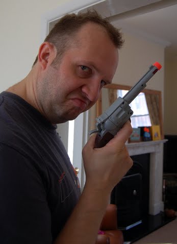
(If Karl Urban drops out of the Dredd movie we have a ready made substitute!)

Moving swiftly on to the final images! Neil continues "As you can see the first version is a bit flat in the halftone range and I haven't added much texture..."

"This was followed by the final version in which those issues were resolved. Then it was sent to Tharg for the beautiful design work by Simon and Luke - those guys should get muchos credit as they do a great job, week in, week out..."
Yup, as Neil said, Tharg's design droids absolutely excelled themselves here. The logo makes you question your sobriety and the fly on the 2000AD icon sets it all of perfectly. Simply brilliant.
Thanks very, very much to Neil who has once again sent some outstanding images and highly entertaining text. He's a very busy guy and totally up to his (skinny) elbows in work at the moment and it speaks volumes that he has taken the time and effort to send so much for our entertainment. We salute you sir!

Please visit Neil's site and blog to see more Roberts loveliness!

Saturday, 2 October 2010

Super Squirrel Undefeated!

Carlos Ezquerra (or Charlie Squirrel as he is affectionately known) is the undisputed king of the 2000AD cover! He has created a staggering 91 covers for the Prog alone (his nearest rivals are Cliff Robinson with 81 and Ian Gibson with 53) and countless others for Megazines, annuals and other fine 2000AD publications.

Fans around the world were shocked earlier this year when the man who created legends such as Judge Dredd, Johnny Alpha and Major Eazy announced he'd undergone surgery for lung cancer. Having had one lung removed, Carlos informed us that he was beginning chemotherapy treatment.

Enter superfan Mark 'Legendary Shark' Howard who had the brilliant idea of enlisting fans and professionals to take part in a 'Secret Project' to make Carlos a get well soon comic to help keep those thrill suckers at bay. Industry giants old and new such as John Wagner, Cliff Robinson, Andy Diggle, D'Isreali, Boo Cook, Neil Roberts, Mark Harrison, Mick Collins, Leigh Gallagher, David Lloyd, Henry Flint, Al Ewing, Alex Ronald, Barrie Mitchell and many,many more contributed to make an incredible, and very moving, tribute to a man who has touched the lives of thousands.

Enter star artdroid of the future Kevin Levell... A real rising star (please check out his blog and website and don't forget the fantastic Fractal Friction webcomic of which Kev is a regular artist,) who was put on cover duties after the project's editor hit a snag. Mark said "The cover was created by Kev Levell at very short notice after the original artist fell through. He also designed a logo for my local printer's motorcycle club as part of a deal I got for cheap printing. All hail Sir Kev!"

Kev takes up the story, stating that he wasn't over the moon with his work "It was a bit of a rush job and all I can see are the things it could have been!" The man is obviously mad, the image is absolutely excellent. He continues: "Here is the main image Mark sent me and pretty much the template for the cover, Mark asked that I use an appropriate logo and had a few key things he was trying to achieve but that was it really."

The reference picture as sent by the Legendary Mark Howard


From that jpg, Kev came up with those great sketches below. "These are very rough sketches, trying to vary it enough from the reference and get to something that conveyed the 'Supersquirrel' idea. I think the Moustache had to be there!"

Just some regular sketches of a squirrel with a moustache

Here's the pencils for the cover which Kev had designed with a portrait design in mind "I'd assumed we were doing a regular format comic, and my idea was to wrap the tail around to the back cover... but when Mark approved the pencils, he mentioned that the format would now be landscape, I think it was simply to fit more in, and if you've seen 'SuperSquirrel Undefeated' I think you can imagine why he had to do that."
Charlie Squirrel pencils

Next follows Kev's beautiful inks, "I normally scan my pencils, turn the line blue in Photoshop and print them out on appropriate paper, be it Bristol board or just bog standard sketchbook paper, something that will take the ink well though. I inked this using a Pentel Chinese brush pen, a recent acquisition that seems to make me ink a bit quicker... and time was of the essence!"Those gorgeous inks...

Ever the perfectionist, Kev begins to put flat colour down on the image. "'I've scanned the inks in, tidied them up where necessary and laid flat colour down... here I've already started to digitally paint the squirrel, but it's looking a bit flat to me..."
Still not satisfied, Kev continues "I've added a bit more depth to the squirrel, but it still needs something... More often than not, I try to keep the background colouring on a different layer, so I can easily add over-layed textures without having to cut out the figure/s."
To accentuate the subject a bit more, Kev uses a favourite trick of his: "I very often find that a secondary light source can help pull a character off the page, that's mainly what I have done here before I add some final textures to the whole thing to take away as much of the 'Photoshopped' feel as I can. I actually add the textures as active layers earlier in the process, and turn them on and off as I get a better idea of how the overall thing will look and I can still edit the rendering if I'm not happy."
A secondary light source is added to lift the squirrel a bit...

And the final image with additional textures and tweaks! I'm sure you'll agree that Kev has done a sterling job and has done both Mark, and more importantly, Carlos proud.
Is it a bird? Is it a plane? No, it's erm... Supersquirrel!

I am absolutely certain that we will one day see Kev's name in the credit's box in 2000AD and for me it can't come soon enough, his work is excellent. Oh, and if you were wondering about that motorcycle club logo, wonder no more...

I was honoured to be asked to contribute to the project and, as stated at the beginning of this post, thought a fitting tribute would come from highlighting the sheer volume of covers Mr Squirrel has given us. It took a whole day to do, but was well worth the effort!

My sorry attempt...

When Carlos received his copy he sent this wonderful message to all who had contributed, sniff!:

So, want to get your hands on a copy of 'Supersquirrel Undefeated?'

Quite rightly, Carlos owns the only unwatermarked copy of the comic but you can download it from http://www.zshare.net/download/8035759096751fc8/ or http://dl.dropbox.com/u/9075096/supersquirrel_undefeated_pblc_cpy.20100903-175749.zip.

Naturally the comic is free but anyone who enjoys it is urged to donate to a cancer charity, for example http://www.cancerresearchuk.org/

"Aw maaaan, I love Carlos, I wish I'd gotten involved!"

Never fear! Due to the secrecy and tight deadline of the first volume, the makers of the comic know that many people who would have liked to have contributed may have missed out. So, a second volume is planned. Full details are available from the following link: The Not-So-Secret Project.

Thanks to Kev and Mark for allowing me to do this blog post, you both should be ridiculously proud of yourselves, you lovely people!

Wednesday, 29 September 2010

No go for Defoe on 1704!

Poor Leigh Gallagher felt the wrath of the Mighty Tharg when coming up with this beautifully designed Defoe cover for Prog 1704. Over at his fantastic blog he tells a sorry tale of pride and rejection. After coming up with some great ideas (shown below) he decided to replicate the painted style of his beautiful cover for the TPB of Defoe 1666.

So, Leigh kept his pencils fairly rough as he was going to paint over 'em anyway...
Which he did, to produce this awesome digital painting...
However, Tharg the Grumpy decided he wanted to see more line work, giving poor Leigh the choice of either inking his already painted image or face a session with Mek Quake. Modest and professional to a fault, Leigh agreed with the bad tempered Betelgeuisian and added some outlines to turn out yet another amazing cover...
Please read Leigh's hilarious version of events over at his brilliant blog. Oh, and I'm sure the ladies would pay handsomely to see the photo refs he did for this cover!

Monday, 20 September 2010

Who's afraid of the big bad wolf?

Yet another stunning cover by Jon Davis-Hunt, it's absolutely outstanding! This is for the superb story Age of the Wolf written by Alec Worley with beautiful art by Jon. The cover depicts Rowan, our plucky heroine, pursued through an eternally moonlit, snow-filled London by a pack of rabid werewolves and their as yet, unnamed leader.

Below are Jon's inks. Jon is a big fan of Katsuhiro Otomo's work, the artist responsible for Akira, so I'm sure he must have been thrilled at the prospect of drawing some bike chases of his own...
Next flat colour is added and a box to denote the 2000AD logo...
Rowen is shaded, bringing out essential detail such as the highlights in her hair, the shape of her nose and those all important cute freckles!
Crikey! The git big wolf is inked into the background!!!
And again, flat colour is added...
The wolf is staggeringly brought to life with the use of highlights and shading, a bit of saliva and some fantastic fur. The dark skies set the picture off...
Finally the finishing touches are added to bring the whole image to life - a whirling snowstorm, that cool headlight and a motion blur that brilliantly suggests a roar! Truly a classic cover!
Here's how it looks on the news stands...
Thanks yet again to Jon for being so kinds as to send the images. Remember to visit his site at here where you will find all kinds of goodies! Examples include the beautiful teaser for 'Age of the Wolf...'
This stunning page from a 'Tales of the Black Museum' story called Purgation (by Arthur Wyatt) sees a perp falling through Dredd's chilling alternative reality...
Finally this amazing spread from Tempest - brilliant!

Thursday, 16 September 2010

Ding dong! Dredd calling!

Wow! The amazing Mark Harrison, Rebellion's head of concept, is back with an explosive Dredd cover to accompany the current 'Skinning Room' tale. The cover is packed with movement and intelligent little nods to some of Mark's favourite movies. Fans of Mark's work know that he loves to 'audition' Hollywood actors in his art and add cinematic 'Easter Eggs' to enhance the experience for the reader. This cover is no different so, over to Mark...

"Here's the Dredd cover story: I took a couple ideas of Dredd to Tharg as possible covers; The first was Dredd referencing a "Dirty Harry: Magnum Force" poser with the Statue of Justice in the background..."
Mark's Idea (above) and the very cool Magnum Force poster below...
Mark's second cover idea was also based on a couple of no-nonsense American Cops, John Wayne's James Brannigan from the 1975 action flick Brannigan (see the trailer here) and Sylvester Stallone's controversial portrayal of Megacity-One's finest. "My other idea was Dredd kicking in a door blasting; partly inspired by the John Wayne film "Brannigan" where he kicks down doors with a "Knock knock!" and the moment we first see Dredd in action in the film Judge Dredd as he "pacifies" Block war rooms. In fact the latter choice would define Dredd for me as I struggled to put my take on the look of Dredd..."

Above, Mark's sketch for the cover.

As we all know, Mark was a pioneer of digital art and it's use is still an integral part of his craft. He continues "The sketch approved, I quickly knocked up a Poser figure in a Bryce corridor (both 3-D apps I use occasionally) , a very basic texture overlaid onto the background (same one I've been using for years on Durham Red) to give perspective and some dynamic lighting to give me a foundation point. I had something clearly in mind; as in the movie, Dredd has blasted open the door and eased into the room into a half crouch as he rapid fires in an arc, taking out all the perps. A lot of repositioning; balancing the silhouette of the figure in the doorway. Not too low as to be lost, but not so high as to be a giant. Also space for the dynamics to work, the guns spinning out of flailing hands. A good chunk of time finessing this spacial relationship, where 3-D really helps (although i fudge it in the end!)"

"I'd had a chequered past illustrating Dredd in the past, first trying to realistically portray him then following the art styles of others. I decided I wanted to do "my version" for a change, a hybrid of the comic and the movie. Whatever you might think of the movie "Judge Dredd," there are some good design choices there. I liked the chunky, blocky look of the design throughout. My favourite comic version of Dredd is the very first Ezquerra/McMahon "Motorcycle Helmet" Dredd. The scaling of the uniform is at it's most practical and Dredd looks like a young, lean, pouting and arrogant Clint Eastwood from the Dollars movies."

Mark continues "The movie had a great helmet look. One thing I liked was how it squared off the "Death mask/skull" red flashing on the helmet. Rounded I think it looks weak and the movie one front on it looks quite devilish, so I incorporated that look into the helmet. I also preferred the turned up collar. It feels more military, stiff, tight and formal and more in keeping with the discipline of a Judge."
Above - The Block War scene that was obviously an inspiration and the 'devilish' movie helmet.

"The helmet alone accounted for 30% of the time spent on this image, refining it and getting it right. Even now I'm looking at the eyes thinking should I have dropped the angle a millimetre or so."
"In the sketch I originally had Dredd bursting in, respirator down, having Stumm gassed the place, gasses swirling dynamically, but thought it would be better to see his face. The chunky angular respirator, eagle and shoulder pads also fell into that blocky, utilitarian look. I should have carried to look through to the badge and belt buckle but I had been generously given a Termight Replica badge by Wakefield Carter and I thought it would be a shame not to use it!"

WARNING! The next part may be controversial!!! "Elbow and Knee pads were a pain. I confess I don't like them- the green just doesn't work. (Sorry Carlos!) So I darkened them down to muddy green and had the scene lit by green muzzle flashes. Why green? That's a nod to the Sandman's gun in the film "Logan's Run". (In the book the Sandmen were judge, jury and executioner and their guns fired 6 types of round including heat seeker. I "challenged" Mr. Wagner that "Logan's Run" was an influence on Judge Dredd and he growled that he "read a lot of books"....)"

Mark lets us in on some of the in-jokes in the text on the piece and manages to squeeze in another film reference! "A key ingredient in any Dredd story is a dark humour, so I have a sort of scrolling LED display above the door saying "YOU HAVE A VISITOR" that you can imagine being cheerfully announced moments before Dredd bursts in and guns down the occupants!
The "Smart door" also carries a bit of text (and some in-jokes) on it; an overlay that suggests that Judges in a crackdown situation can render all doors unlocked. I always liked it when the world of Dredd whilst exciting and heroic also carried this underlying feeling of oppression and the denial of human liberties. Dredd is not a nice guy. He's just better than the alternative!"

As for the door text, the "1187 Hunter Gratzner" was deliberate; I changed it from Blade Runner's "1187 Hunterwasser- I loved those model maker guys!) "K.Howell" is a friend of mine who *HATES* Judge Dredd. Dredd isn't too fond of him, either!"

"Finally, some gun smoke and debris and motion blur to suggest kinetic movement in the scene. Again, another balancing act of too much vs too little.

Some background detailing from the inside of a helicopter for the corridor (probably not necessary, my biggest weakness, knowing when to stop) I wanted it to look like the bowels of a ship or cargo containers. Not nice living quarters.

Some colour passes and tweaking, bring out the red of the helmet and bringing up the values on the eagle pad and face to centre the readers eye (and hopefully lessen the naturally lighter lit corridor behind.) Some specular light from the gun flash right on the bridge of the nose. Okay, we lost some red but the high point centres the eye. Check back with the sketch to see if can restore some of the energy lost in the process. Add a bit more "whoosh" and "zap" brush marks... done! (Entirely painted in PhotoShop CS2)"
"Efforts prove a hit with Tharg who likes the movement in the scene."

And dammit, so do I. A fine cover that is superbly cinematic, taking the best elements of the flawed old Dredd movie and creating a masterpiece. Ironically, Mark tells me that "A few days after submitting the work it was announced a new Judge Dredd film was being made!"

So here's hoping the new movie has half the passion and intelligence that Mr Harrison puts into his work! Thanks to Mark for the fascinating info, especially as he wasn't at his best when he sent it. True services to thrill power!

Sunday, 5 September 2010

Leigh Gallagher (Crocodile) Rocks!

Hey you stinking Reeks! Shuffle over to Leigh Gallagher's wonderful blog to see how he put this weeks' superb cover together. There you will see his rough proposal for Tharg (complete with cheesy tag line,) hilarious (but ever-so-sexy) reference photo, pencils, fantastic inks (shown below) and the final, zarjaz image!

Naturally, Leigh explains the processes involved at each stage in his humourous style. One of the things that made me chuckle is that he was very pleased with the way the light shone through the water; however, both the preview image at the back of prog 1700 and the actual cover has this obscured by lettering! It's Karl Richardson's Big Ben all over again!
So, head off immediately to Leigh's Blog to get all the info. Also, be sure to check out his hilarious interview with Everything Comes Back to 2000AD's Richard McAuliffe's over at Geek Syndicate.

You can see the rest of Leigh's amazing 2000AD covers here too.