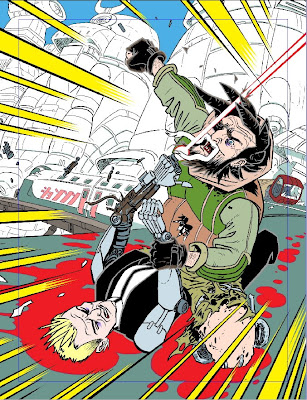
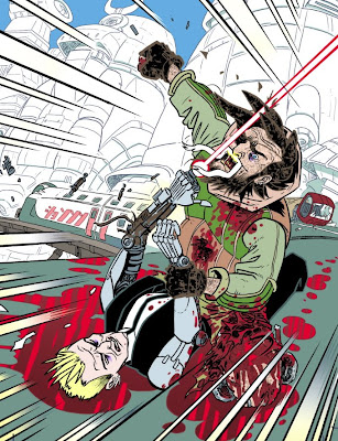
An absolutely explosive cover to mark the end of (hopefully) the current series of Low Life. Dirty Frank and Dirty Judge Aimee Nixon, slug it out atop a high speed train in Hondo City, could you ask for more? The cover is, of course, by bona fide artistic genius D'Israeli who has been kind enough to send a brilliantly detailed master-class of his creative process as well as links to some freeby files!
Over to Matt, who begins with his brief as decreed by the Mighty One:
“Frank and Aimee struggling on top of the train, maybe viewed so we see the length of the train beyond them and the drop and the city around them. Frank is holding Aimee down, other fist raised, Aimee's gun coming out of her robot arm.”Matt begins "
Once I started sketching out the design I made one small tweak which was to have Amy’s gun firing close by Frank’s head - I thought that without that sense of immediate threat to Frank’s life, the image of a big, hairy guy holding down and about to punch a woman would have looked a bit dodgy!" Ha ha, I see what you mean!
The first stage is done in Manga Studio Ex 4, I'll ket you know when we switch to Photoshop...
Below we see Matt's rough sketch Matt's first sketch to get an idea of how the cover will look: "
First try at the composition. I actually think this is a better drawing than the one I went with, but the figures don’t fill the frame as well. By moving around to the right and getting a bit lower, the figures fill the frame better, and I think there’s a bit more sense of impact..."
"
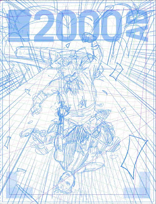
I’d built a template file in Manga Studio for the previous Lowlife cover - this contains various drawing layers with colour options set as I want them (Manga Studio can be set so you can only draw with one colour per layer - I use colour coding for the different stages of the drawing). The template also has 2000AD’s own cover guide embedded, so I know how much space will be taken up by the logo and barcodes.
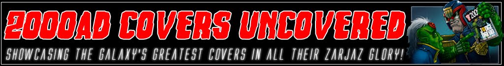
I use Manga Studio’s perspective rulers to set up a three-point perspective grid (on a perspective ruler layer, right-click any vanishing point with the Object Selector Tool (fig 2a) which gives you a dialog box with controls for colour and number of lines that radiate from that vanishing point (fig 2b). Manga Studio famously has Perspective Rulers that force you to draw straight lines in perspective, but here I’m drawing curvy Dredd-world architecture, so I just want to know where the perspective lines run so I can draw curves around them.
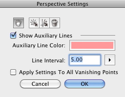
I draw in rough “skeletons” for the figures and a quick indication of where the train’s going to go. At this stage getting the figures the right size, in the right place and the right pose is the main thing."
Fig 2a

Fig 2b
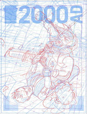
Next onto Matt's rough pencils, he continues "
At this point I’m blocking in the figures and the background (this is what I’ll send to Matt Smith for approval). I’m thinking in broad terms here - for example, Frank’s face is a bit crude, but I’ll fix that at the next stage.""One of the problems of drawing with a Wacom tablet is it’s easy to lose track of what scale you’re working at, and end up fiddling around with details so tiny they’ll barely print. Though I dislike drawing with real pencils (one of my reasons for switching to digital was so I could draw from the start with truly erasable pen), I’ve started using Manga Studio’s Pencil Tool for roughing and pencilling, because the lines break up into dot patterns if I enlarge too much (fig 3a shows maximum scale at which lines display normally, fig 3b shows lines breaking up into dots, signalling you’re working at too large a scale.) This feature literally helps me keep things in proportion!"
"One place I have used Manga Studio’s Perspective Rulers is for the “speed” lines around the edges of the frame." 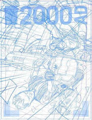

Fig 3a - Normal lines...
Fig 3b - Lines breaking up.
Time to tighten up those pencils, "Here I’m tidying up the figures and adding more detail. I don’t usually bother fine-tuning backgrounds, since with digital it’s easy to erase and correct drawing done at the inking stage..."
"
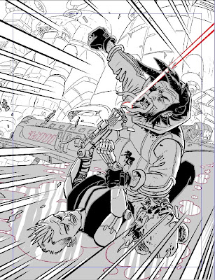
Next we see my inked outlines over pencils. I use five or six layers for my inks, separating out foreground from background and allowing me to isolate the grey outlines of Aimee’s suit, which I’ll want to convert to colour at some point."
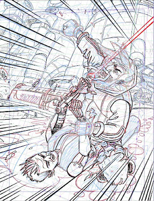
As D'Israeli continues to ink, the image really begins to take shape. "Here are the inks with blacks - the blacks again are on their own set of layers - this lets me separate the black of Aimee’s suit (which will stay solid black) from the black of Frank’s hair (which will be filled with texture.)"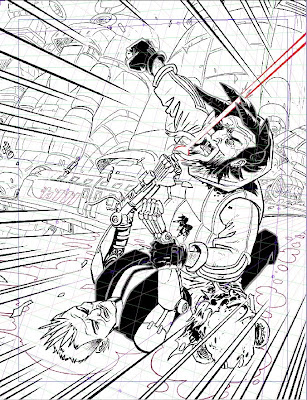
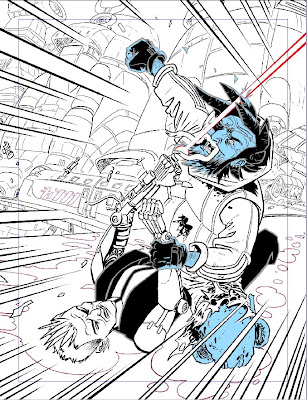
Below, we see D'Israeli begin to add his “Flats” - "
On a layer below all the others I start filling the different parts of the drawing with flat colour. I use Manga Studio’s Paint Bucket Tool for this - like Photoshop’s Paint Bucket, it can use lines from other layers to constrain the fills, but also it can be set to ignore small gaps, much reducing the constant “flooding” you get with the Paint Bucket in Photoshop. It can also be set to automatically expand the fill a set number of pixels under the surrounding outlines.
Since I started using Manga Studio, I’ve switched over to doing all my basic “flatting” in that program. It’s startlingly faster than using Photoshop, and I’d recommend anyone doing a lot of colouring to try it. Photoshop is still much better for the more sophisticated stuff, though..."
 Next the artist begins to add some of the yucky details "I've added bloodstains and reflections to the pool of blood under the figures. As well as the colouring, I add two layers that I’ll process later in Photoshop (for clarity, I’ve hidden the colouring in the following examples, but it’s still there)"
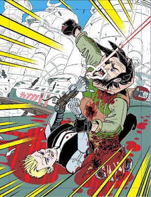
Onto shading - "
I know I want the foreground figures to be in shadow (so the muzzle flash from Aimee’s gun will look more dramatic.) On a new layer, I fill the areas I want shaded in grey. I’ll change this later in Photoshop."
This leads us nicely to some of Matt's exquisite texture work as he begins to work on a layer of 'Grot!' - "
Grot - Frank’s face and hands are meant to be permanently grimy. On a new layer I add fills to the areas I’ll want to have the “grot” texture. Again, this awaits more work in Photoshop."
Phew, with all the preliminary work done, it's time to change programs "
WITH ALL LAYERS MADE VISIBLE, I EXPORT THE FILE FROM MANGA STUDIO IN PHOTOSHOP FORMAT."
"
Manga Studio can export at various sizes and resolutions but the best method I’ve found is to export at 600dpi (giving best quality from the Manga Studio file) and then reducing to a more manageable 400dpi using Photoshop’s Image Size function with “Resample Image” set to “Nearest Neighbour (preserve hard edges)". 400dpi is the lowest resolution where the image will print smoothly without the image pixels being visible as little “steps” on hard edges. At lower resolutions you can use a slight blurring (anti-aliasing) to hide the stepping, but it makes making selections and fills a bit more fiddly..."

Back to adding Grot - "In Photoshop, I go to the layer containing the blue “grot” mask. I Lock Transparency for that layer, fill the blue areas with white (Edit: Fill) and then set the Layer Blend Mode to Multiply, which makes the white fill transparent. Since locking transparency means I can only work on areas of that layer that have been filled, I can now dab texture onto Frank’s face and hands (using a texture brush of my own making) and the texture will only appear in the areas I defined."
"On the layer containing the black of Frank’s hair, I again Lock Transparancy and set the Blend Mode to Multiply. Using the Paint Bucket Tool (with the “Anti-Alias”, “Contiguous” and “All Layers” check boxes all unchecked), I fill the blacks in one go with a texture I made previously (by picking “Pattern” from the “Foreground” pull-down menu in the upper menu bar.)"
Matt has very kindly shared some of his textures "If you want to try some of my texture fills, you can download a set from http://dl.dropbox.com/u/1357329/04-04-09%20Lowlife%20Grot%20Textures.pat . The patterns should be compatible with CS3 or later (it’s worth trying if you have an earlier version of Photoshop). For help in loading the patterns, run Photoshop Help and type “Manage pattern libraries and presets” into the search bar."
"
Shading - I went to the layer I’d set up as a shading mask (four pictures up - Pete,)
and, you guessed it, Locked Transparency, set Blend Mode to Multiply, and used Edit: Fill to fill the shaded area with a light blue-grey (it’s the colour of the body of the train in the background). Setting Blend Mode to Multiply means that everything under the blue shadow is tinted as if I’d put a watercolour wash over it."
"I now want to tint everything that’s not shaded blue with a pale yellow tint to indicate evening sunlight. The easy way to do that is as follows:1) Make sure you’re on the layer with the shading.
2) Go Select: Load Selection…
3) A dialog box will appear with two pull down menus. The top one will have the name of the current document. Leave that alone. The bottom one should say “(name of layer you’re on) Transparency” (if it doesn’t, pull down the pull-down list and pick it). Click OK.
4) All the shadow-stuff will be selected. Go Select: Select Inverse and now everything that’s not shadow-stuff is selected.
5) Make a new layer and pick the colour of your choice (in this case, a nice light yellow) from the Photoshop Swatches.
6) Edit: Fill
7) Adjust the transparency slider of the layer until underlying colour are showing through as you wish (in this case the colour is a highlight, so I’m not setting the Blend Mode to Multiply - I actually want the yellow to obscure the underlying colour a bit, as if I were doing a glaze with oils or acrylics.)
This method looks a bit complicated, but it has the advantage that you can make a “counter-fill” of things containing gradations or soft edges in a way that just won’t work with the Paint Bucket or Magic Wand tools."
 "Modelling - at this point I make a couple of new layers below the outlines but above the colours - one will be for shading, and is set to Blend Mode: Multiply so the contents will darken what’s below them like a wash. Another has Blend Mode: Normal but Opacity set to 50% to give me highlights (like using semi-opaque acrylic paint.)"
"I dislike the very soft shading often produced with Photoshop, so I use either the Pencil Tool or the Lasso Tool (plus Edit: Fill) to draw in my highlight and shadow areas. I use the same grey-blue as before for shading. Highlights are either the pale yellow from the background (for highlights coming from the right) or a pale blue (reflected light from the sky) coming from the left. That extra pale blue helps both to define the shapes of the figures and to “pop” them forward from the background. I also add some gradations to the roof of the train and the blood puddle under the figures (to select small areas of fiddly colour, try drawing round them with the Lasso Tool then using Select: Colour Range…)"
"I don’t want all my shadows and highlights to be entirely hard-edged, so I use an adapted Photoshop brush to soften some of the edges. This brush is quite hard-edged, but pressure sensitive, and leaves an effect a bit like brush strokes. I have a set of Photoshop brushes available for download here: http://dl.dropbox.com/u/1357329/04-04-09%20Matt%20Tool%20Presets.tpl - to load them, run Photoshop Help and enter “Load, save, and manage brush presets” into the search bar. Once loaded, the brushes will appear in a pull-down list at the top-left of the screen when you have the Brush Tool selected. The ones I’ve mentioned here are called “Brush Tool Hard Round (size)” and come in several sizes."

Almost there, but I'll be honest, I don't want this fascinating tutorial to end! "
Muzzle flash and glow - the final step was to add an orange-yellow glow to Frank’s face and chest from the flash of Aimee’s gun. This was done in the same way as described in the previous paragraph. A circular gradation was added around the muzzle flash to give it a bit more “pop!”
The very final stage is conversion to CMYK mode and flattening to TIFF format before sending to 2000AD via FTP."
Simply, simply stunning! It's humbling to see a real draughtsman at work and a privilege to be able to share his talent with you. Thanks so much to Matt for being so kind with his time and for those brilliant free resources. Please remember to visit his fantatically informative blog
here for more pearls of wisdom and really in depth articles on the creative process.